The Scope
The Home Depot offers customers a mobile app to browse products, find stores and make purchases. They're now introducing a DIY feature within the app so users can track and manage their projects. My team and I were in charge of designing this feature.
The first task was reviewing their current app and website to assess if any features fell short of current UX/UI standards through a heuristics evaluation, along with a competitive analysis to see how other companies oriented their platforms and had existing DIY features.
Taking Influence from Competitors
C&C Analysis
We looked at other home improvement related websites and apps that had personalization, planning, and instructional features for inspiration.
-
IKEA has an option to upload a picture of your space where items and products can be added to the space to view how it'd look.
-
When looking at OBI, ideas were gathered on how to create customized pages to reflect individual preferences
-
We also looked at other apps like Lowes, Houzz, Walmart, and Pinterest for layout inspiration.

Knowing Folks that DIY
User Interviews
As we stated before to get to know the folks that frequent these shops, use these apps and work on DIY projects, we conducted interviews and
To best inform the design of this new DIY feature, we knew we needed to gain insight on the needs of DIY workers whether they are experienced or amateur.
We completed user interviews with 6 people to understand their process of completing DIY projects. Based on our interviews we discovered some commonalities between the users which were:
-
Users are motivated to complete DIY projects in order to save money
-
Most users want to complete the project as fast as possible without a specific plan
-
Users source inspiration from others in person or virtually
Conceptualized Traits
User Persona
Based on our user research, we created a persona.
DIY Danny is somewhat of an amateur DIY worker, but adventurous none the less. Each project is always a learning process for them, so they enjoy the flexibility that comes with the DIY process and are always exited to show off their hard work.
-
Enjoy the customizable options that go along with the DIY process and are loose with deadlines and budget.
-
They know they’re saving money by not hiring help and that is a major motivator.
-
Another motivation is becoming more and more self sufficient.

Addressing Frustrations Within The Experience
User Journey Map
In order to ensure we address Danny’s pain points, we created a retrospective journey map based on the experiences of the users we interviewed previously.
As seen below, the major frustrations in their journeys were based in sourcing materials through several different stores and bouncing around to different platforms for inspiration and directions.
Addressing the root of these problems is how we can ensure Danny is equipped for a smooth and fruitful experience moving forward.

Problem Statement
Once we were able to deconstruct our problem and identify the needs of our users, we developed foundational questions that would allow us to reference the needs of our users while fulfilling those of the business.
-
The self-sufficient DIYer wants to plan their projects in advance, establish a rough budget, and acquire the necessary skills to accomplish tasks independently, all before considering the option of seeking professional assistance.
-
DIYers are seeking a comprehensive solution for project planning. Streamlining the process offers a unified platform where users can budget, shop, and access learning resources all within a single, user-friendly interface.
DIY Danny needs a platform to plan and research their DIY project so that they can complete projects within their skillset and savings budget.
-
How Might we help a user become more self sufficient?
-
How might we create a digestible step-by-step process for a novice DIYer?
Reviewing Our Insights
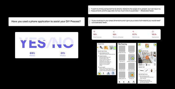
Usability Test with MidFi Prototype
We were able to conduct moderated usability tests and unmoderated tests via Maze to gain insight on how users take to the navigation of the first iteration of our design and ultimately gain generative feedback.
Through the use of the heat map on Maze during our usability tests, we found that users were confused on how to navigate backwards.
Because of this, a back button was implemented.
Listening to the Users
Changes Made
-
We incorporated a back button instead of the hamburger menu on the left corner of the screen
-
Included a filtration based on usability insights
-
We removed the projected finish date, we found this varied based on project and personal preferences.
-
We incorporated a dimensions section to determine the amount of materials needed and which will ultimately impact the budget.
-
We also incorporated an account page for users to keep track of their past saved projects.

Evolution of Design
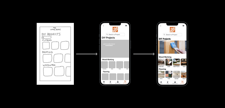
Sketch
MidFi
HiFi Iteration
Sticking to the Brand
Design System
To keep aligned with The Home Depot's branding style, utilizing their existing design system was the best approach.

DIY Feature Implemented
High Fidelity Wireframes

Home Page

Tile Flooring Pages

Tile Flooring Project Page
Searchable Shortcuts Based on Skill, Phase and Dimensions
Project Filtration

Skill Level of Worker

Phase of Project

Dimensions of Project
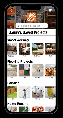
Saved Projects to look back on and Share
Save Project to Profile

All of the User's Saved Projects

Lessons Learned
-
While we found commonalities between users and created the persona, DIY Danny, users approach DIY projects in a variety of ways and creating options for them to orient themselves as they wish with the app was most important.
Next Steps
Moving forward we recommend Home Depot:
-
Expands Augmented Reality feature
-
Conducts a usability test with the high fidelity prototype and iterate based on insights if needed.
-
Describe what the skill levels mean (what does it mean to be a level two versus a level five hammer)
-
Possibly give an option for users to upload projects on their profile to save and share.